
Print-Ready Artwork Setup Guide
 By Hersh Glueck
Print ready artwork is a file the factory can print without fixing anything: the real size, with bleed and margins, in CMYK colour within the ink limits, with crisp text, and still layered so colours can be adjusted on the press. Getting there takes 20 steps in four areas: the file's specifications, its colours, its text, and how the file is kept and sent. This guide walks through each one. Every step matters, because artwork setup is the biggest single cause of delay in a game: a wrong file can hold a project up by months.
Check Out Our Free Resource: Artwork Set Up Guide
The full guide to preparing print-ready artwork files, as a PDF to keep beside you.
Why Print Is Different From the Screen
A screen shows exactly what the file says; a printing press has to make it. On the web you export a JPEG or PNG and everyone sees it as it is. On a press, the printer controls how much of each ink goes on the paper and lines up four separate printing plates. That is why print files need things a web file never does: bleed, CMYK colour, ink limits and layers. The same picture can look bright on screen and muddy on paper if it is not set up for print.
1. File Specifications
The file must match the printed piece exactly, with room around the edge for the cut. Board game artwork setup starts here:
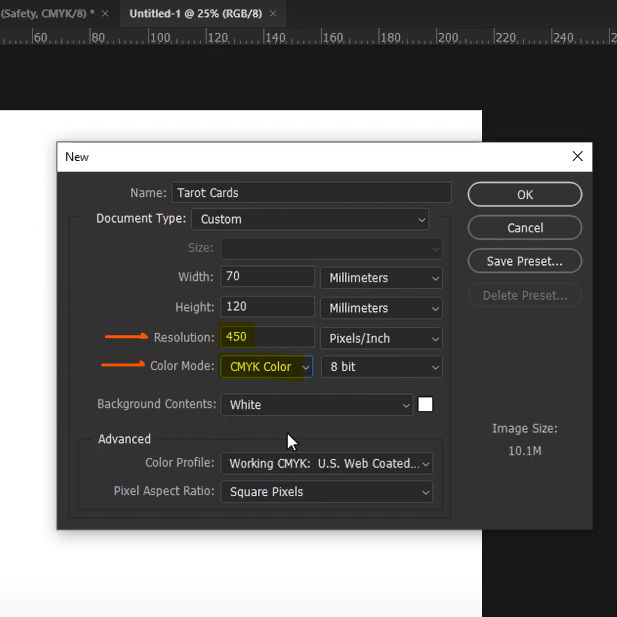
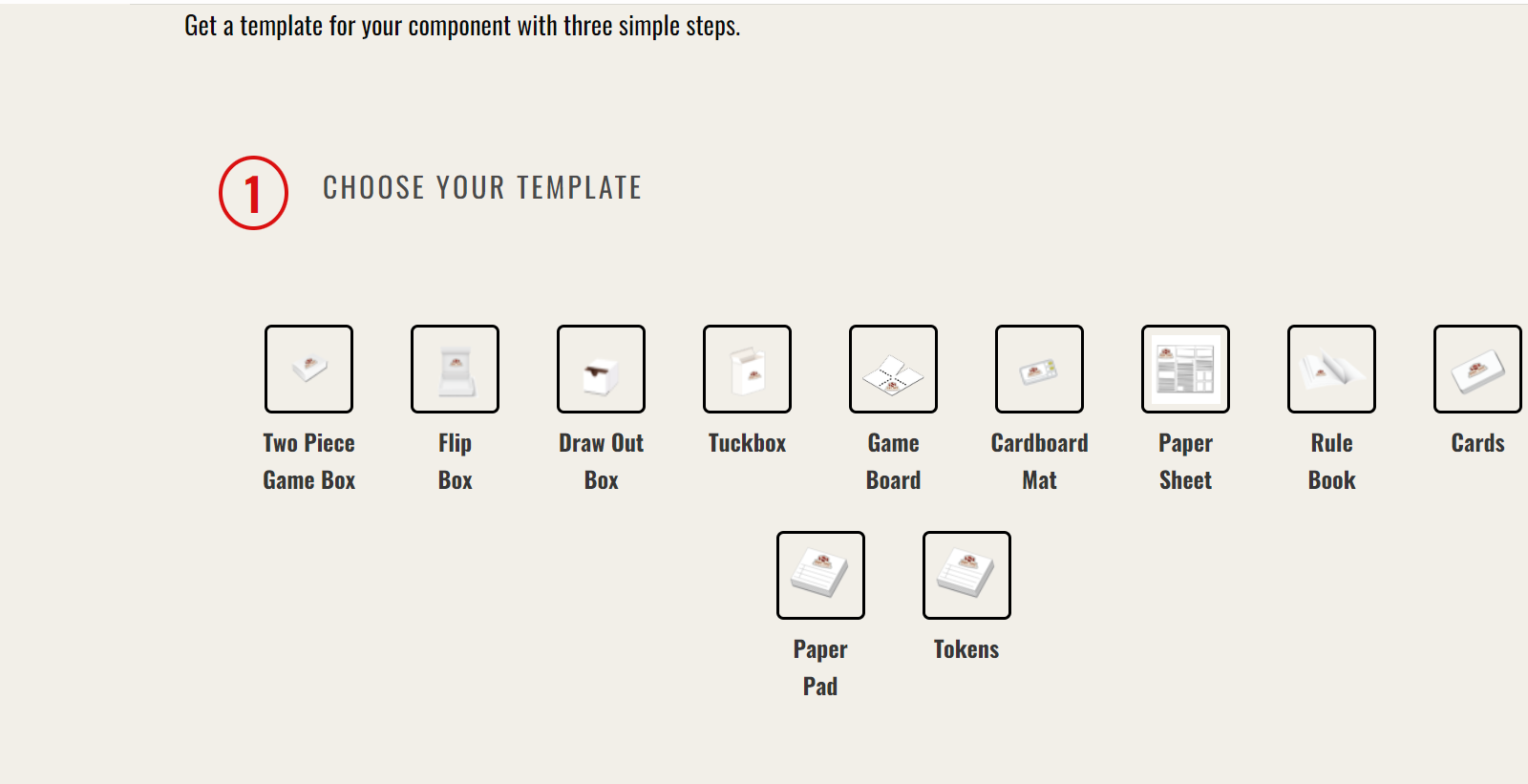
- Work at the real size. Make the file the same size as the printed part, or it will pixelate or lose its ratio when we fit it. Ask us for a template: we send it free, even if you print with another manufacturer.
- Add bleed and margin. Bleed is artwork that runs past the cut line, usually 3 mm on every side, so a tiny shift in cutting never leaves a white edge. A 70 × 120 mm tarot card becomes a 76 × 126 mm file. The margin, or safe area, is the same distance inside the cut line: keep text and icons there so nothing important is cut off. Bleed and margin are the two lines most first files get wrong.
- Use a grid. Gridlines keep every icon and text box centred and in the same place on every card. We cannot fix assets that are out of line.
- Prefer vector, and use enough pixels. Adobe Illustrator uses vector graphics, shapes drawn by maths, which stay sharp at any size. If you use pixel (raster) images, make them at least 300 DPI at the printed size, and 450 DPI for artwork with a lot of text.
2. Colour
Colour is where print and screen differ most, so set it up from the very first sketch:
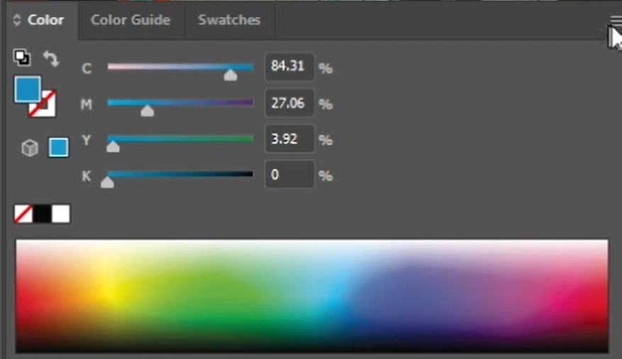
- Work in CMYK, not RGB. Printers mix cyan, magenta, yellow and black (CMYK) inks; screens mix red, green and blue light (RGB). An RGB file can be converted, but it comes out darker and muddier.
- Use swatches. Save every colour as a swatch, so the same red is exactly the same red on the box, the cards and the board.
- Mix two inks on large areas. For big areas of one colour, use two of the CMYK inks plus black if needed, such as C + Y + K or M + Y + K, not all four.
- Keep the total ink under 180 percent. Total ink coverage is the four ink percentages added together. Under 180 percent on large areas gives the best colour control. Up to 225 percent is still possible, but only on a UV offset press, whose instant-drying ink has a coating built in, and the colour is harder to control. Above 225 percent printing becomes extremely difficult, and there is little we can do to control the colour.
- Make gradients in Photoshop. Build a gradient as a raster image and flatten it to a PNG. Gradient meshes drawn in Illustrator turn into a tangle of shapes that is hard to print and to fix.
- Use rich black for big black areas. Plain black (100 percent K) can look grey on a large surface. Add about 40 percent cyan to it (rich black) for titles and large black shapes. Keep small text at plain 100 percent K, because rich black can blur thin letters.
- Choose a colour profile. For your original files we recommend the ISO Coated V2, US Sheetfed Coated V2 or PSO Coated V3 ICC profile. ISO Coated V2 suits pastel, soft and earthy tones; PSO Coated V3 suits deep, vivid colours, such as a fantasy adventure game. Our printers still fine-tune the colour on the press, over about 300 sheets.
3. Text
Text is made of thin strokes of ink, so it is the first thing to blur if the printing plates shift by a fraction of a millimetre. Printers call that shift registration. Three steps keep text sharp:
- Put all text on its own layer, so we can protect it against registration.
- Print black text in 100 percent K only. Coloured text should use two inks at most, such as C + Y or M + K.
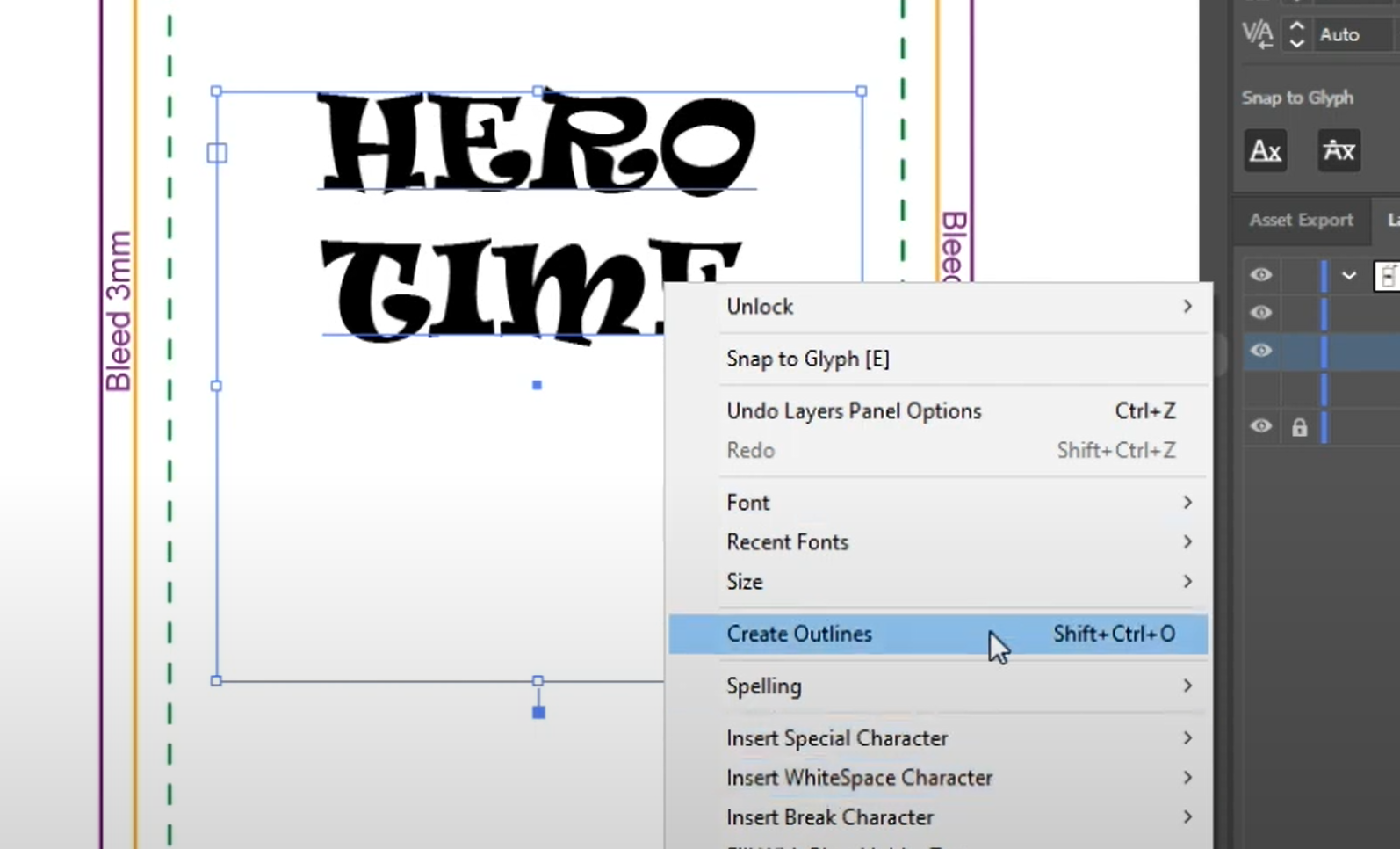
- Outline the text. Converting text to outlines (Ctrl + Shift + O in Illustrator) turns letters into shapes, so the font cannot go missing on another computer. Keep a copy with live text for later edits.
4. File Handling
A file the factory can open and adjust is a file it can print well. These steps keep it that way:
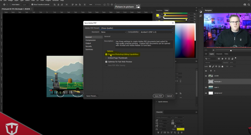
- Place and embed images. Bring images into Illustrator with Place, not paste, as linked or smart objects, so they resize without pixelating. Embed them before you send the file. If one background repeats on many cards, you can link it, but upload the linked image too.
- Keep files layered, not flattened. Layered files let us adjust colour and fix margins. We accept flattened CMYK PDFs, but then errors cannot be fixed, colour cannot be corrected, and a cut that is off by 0.1 mm stays off.
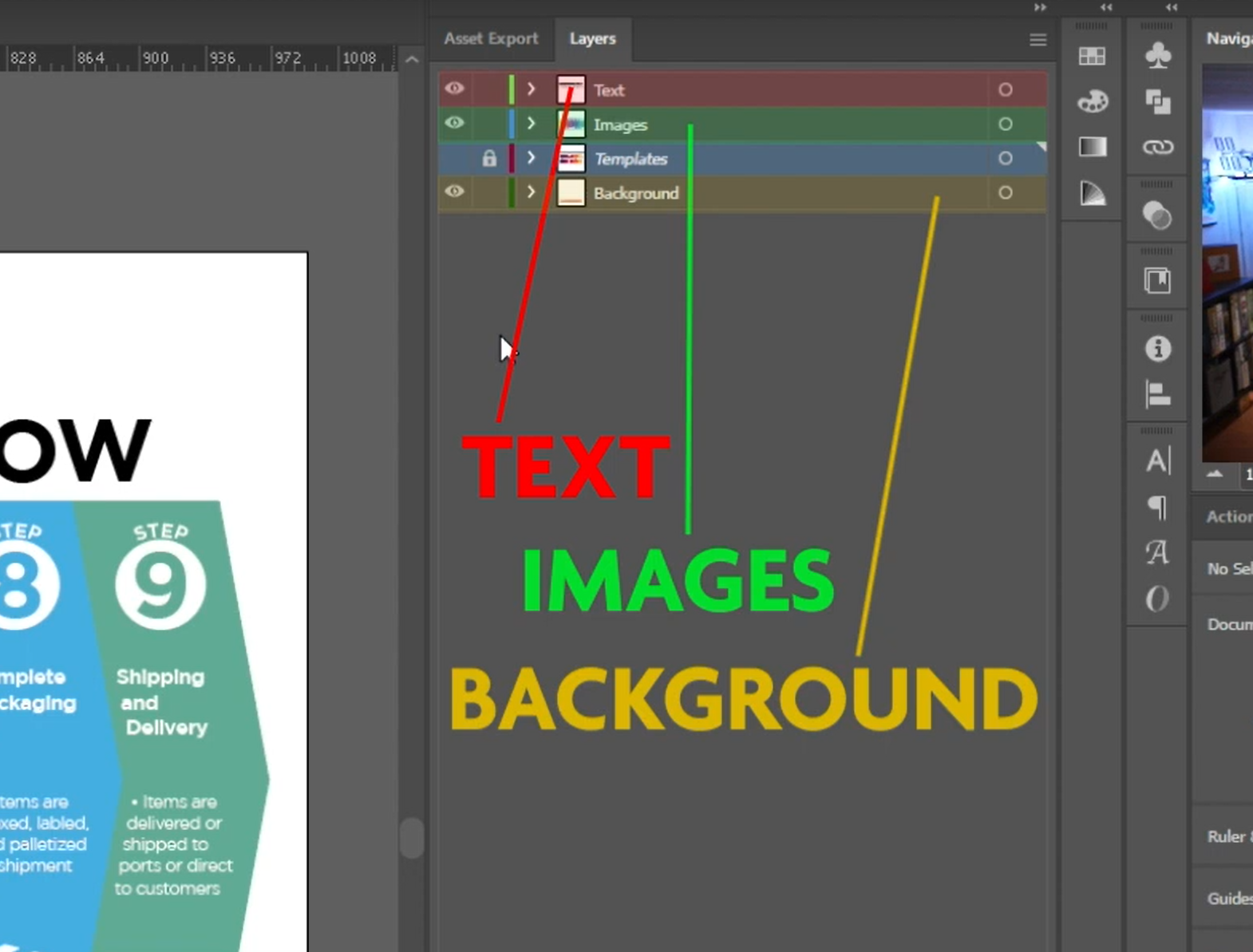
- Use three or four layers: background, images and icons, text, and the template or cutting lines.
- Send the right format. Adobe Illustrator is best. If you do not have it, send what you have in this order: AI, PDF, INDD, PSD, PNG. Send JPEG or other flattened files only if you are completely sure the artwork is flawless.
- Keep each file under 600 MB. To make a file lighter, flatten layer effects in Photoshop and draw simple icons and frames as Illustrator shapes, not images.
- Put one component in one file, with its counts. All the cards in one file, all the token sheets in one file. Under a card that appears more than once, write how many (x2). Missing components are the most common failure we see: a quote says 185 cards and the files hold 120. One file per component lets you count them at a glance.
Uploading Your Files
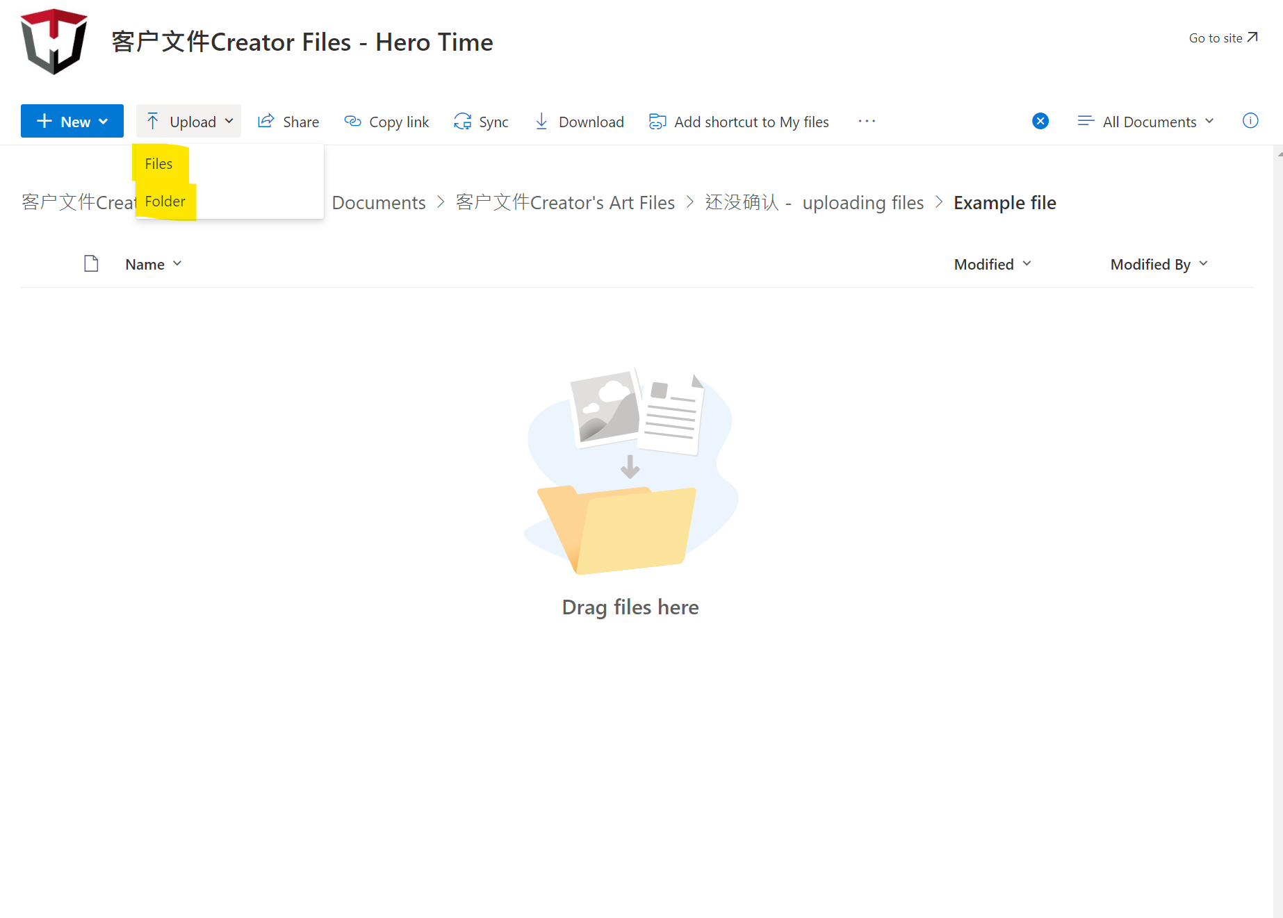
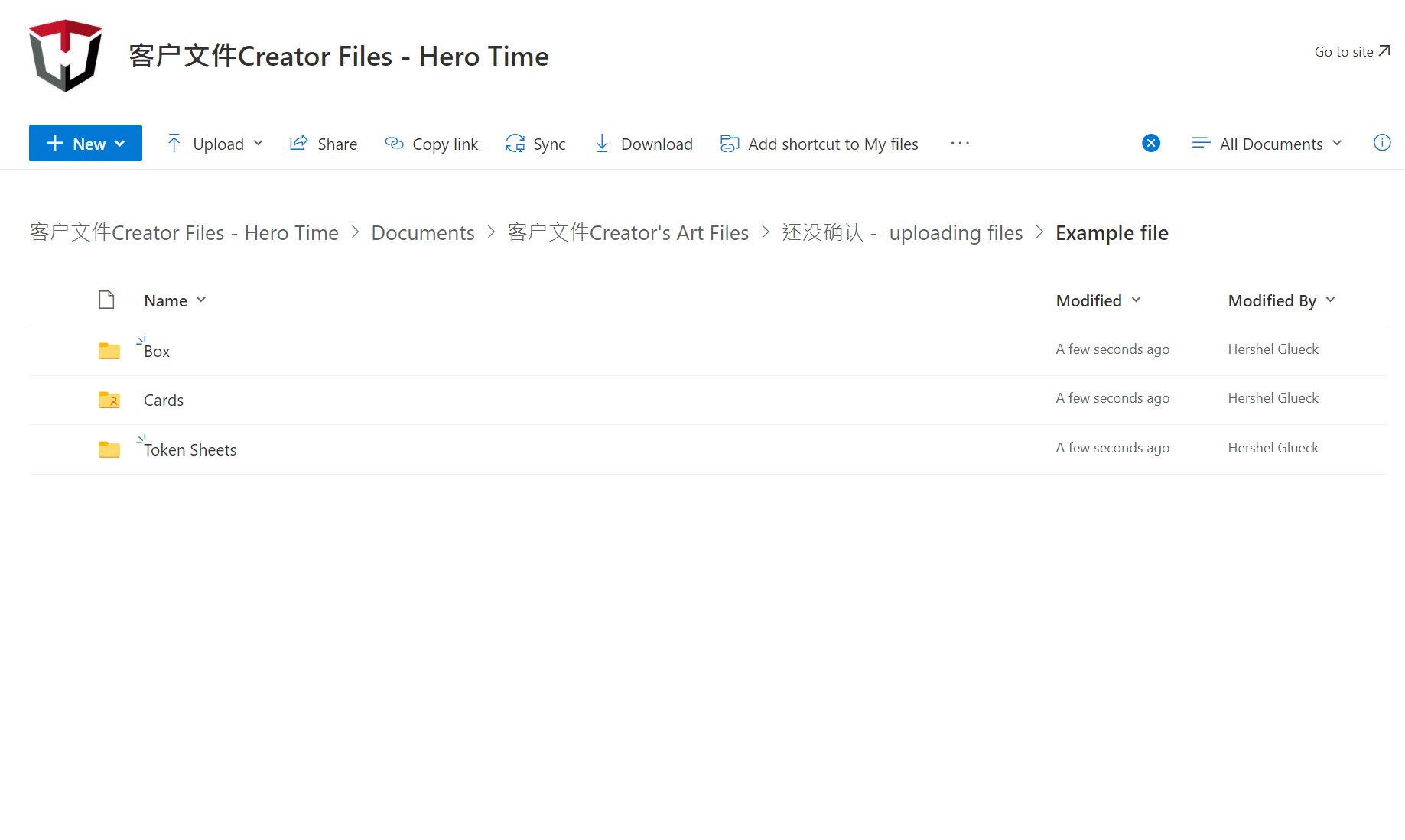
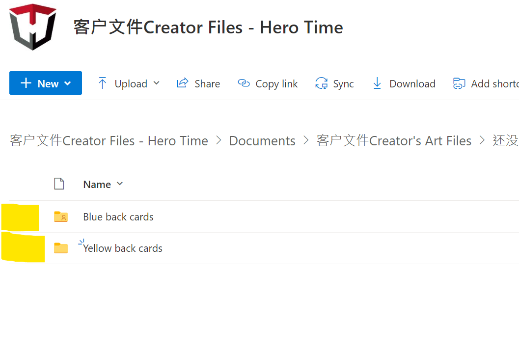
When your artwork is finished, we open a cloud folder for you, and you drag and drop the files into it. Once a file is uploaded you cannot rename or delete it, so check everything before you upload. Four habits make the folder easy to print from:
- Make a separate folder for each component: box, cards, rulebook, token sheets.
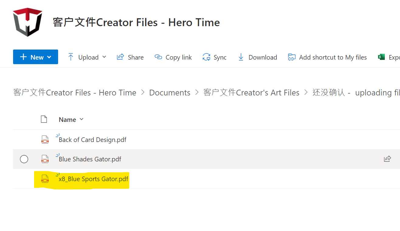
- If your cards have different backs, make one folder for each back. Then every card in that folder shares that back, and you upload the back only once.
- If a card appears more than once, put the count in its name, for example x8_Gator card.
- Lay token sheets out yourself and upload each sheet as one piece of art, on our standard token sheet sizes.
Get Your Files Checked
Before anything prints, we check your files for free and send an artwork issue report: every problem we find, with how to fix it. Small fixes we usually make ourselves. If you prefer to learn by watching, the Artwork Set Up Guide video playlist covers the same steps in Photoshop and Illustrator. The design work behind the files is explained in board game graphic design, and if you have questions about your files, contact us.
Frequently Asked Questions
What is print ready artwork?
How much bleed does a board game card need?
What DPI should board game artwork be?
Should board game art be CMYK or RGB?
What is the maximum ink coverage for printing?
Talk to Our Team About Creating Your Board Game
From design to manufacturing, we can help you with every aspect of turning your game concept into reality.